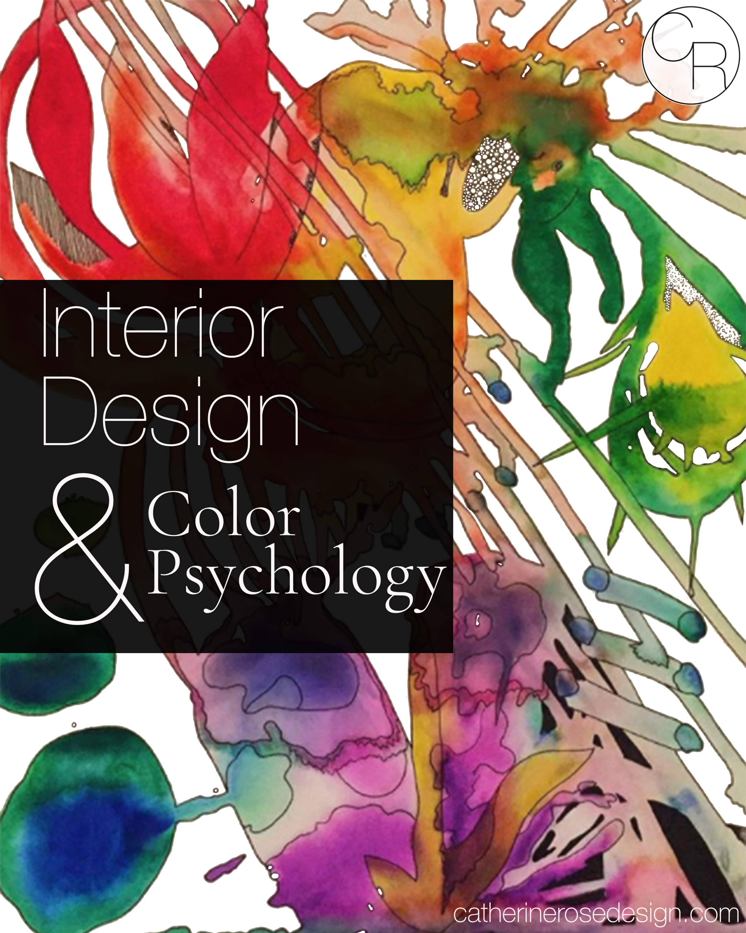
Interior Design & Color Psychology
The deep connection between Interior design and color psychology…
It is easy to be intimidated by the world of color. When thinking about designing our environments a lot of us know what colors we love, but we don’t know why we are drawn to these colors, and many are afraid of combining these in the space we create for ourselves.
In this post I want to explain the psychology behind colors, the importance of color theory in interior design. some techniques and viewpoints to creating an environment that serves your deeper self.
The colors that you choose to live with are deeply important for creating an environment. I want to give you some tools here to empower you to choose color intentionally for yourself, so that you can create in the strength of understanding how your environment may be effecting you on a deeper level. When you understand how these colors make you feel you can choose from an intelligent place.
I want you to feel empowered by this post to intentionally choose your own interior design color schemes. I don’t want you to be afraid that you will make a wrong choice for your environment, because when you follow your heart you can’t lose.
I know paint and decor can be overwhelming for everyone, by focusing on the way that things feel only you can create from a place of power for yourself.
Room color psychology is nothing new but I want to de-mystify they “why” involved so that anyone can choose color and create from their inner selves. The meaning of color psychology can be a personal and fun journey for you.
I want people to create spaces that serve them in every way and support who they are so that they can bring their best selves back into the world for all of the rest of us.
With utilizing this knowledge you can create the environment that evokes the right emotions for you and reflects your personality.
Color deeply affects the way we feel, whether we understand why or not, and I want you to have power over how this shows up in your environment!
I have a funny story about this exact process… When we were little my little sister and I were allowed to re-paint our bedrooms. We were both so excited! Being the deeply sensitive empath I am I conservatively brought my pillow case to match one of the lighter greens in my bedding to the new color on my walls, intuitively knowing the soft green would serve me in my restful space. My little sister being the highly intelligent ball of quirky energy that she is, decided she wanted an electric green for her walls energized by little paint chip she chose… Once that electric vibrating yellow green went up on her walls, in all its immense square footage, my little sister was absolutely shocked, and so sad, crying and begging to re-choose her color! Don’t worry my parents capitulated since that color made them nauseous as well!
Now that I’m older, and a designer, I understand what exactly happened here.
Below I’m going to explain how colors may make you and others feel, and how you can effectively incorporate them into your space no matter what color you love!
I want to empower you to follow your heart in regards to color but also understand how your choices will affect you. Giving you the techniques to be drawn to what you love but, how to use these colors to serve you at the highest level!
Remember! The most important thing here is how these colors make you feel. You should always choose colors that speak to you. However the point of this is to remember that these choices will affect your feelings and the feelings of those around you.
These are basic color associations below, basic interior design color meanings.
When you think of the color what emotions come up for you?
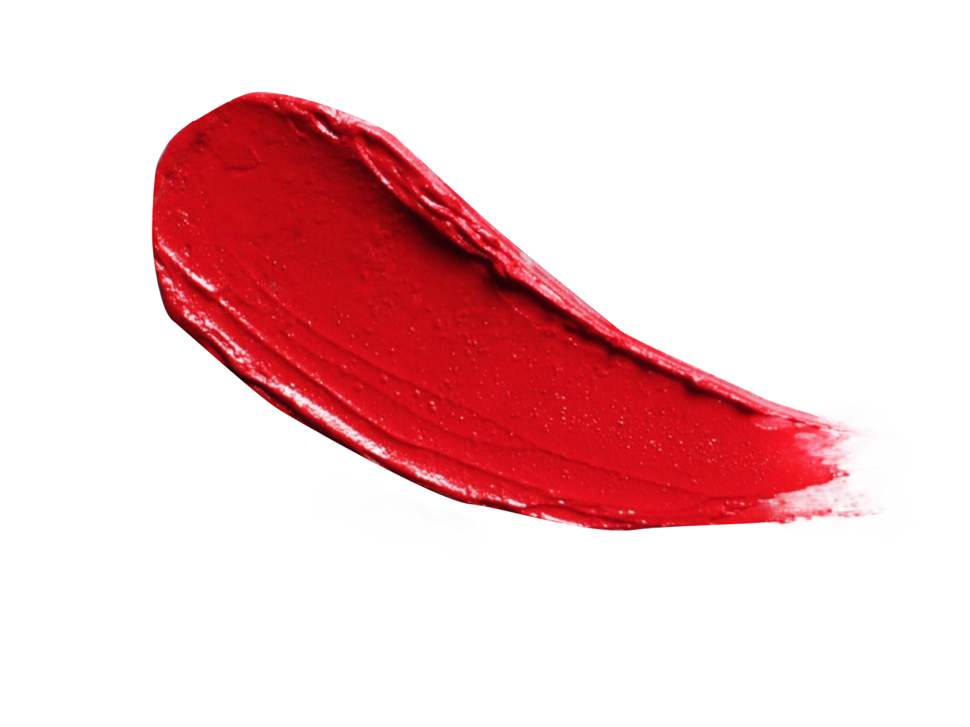
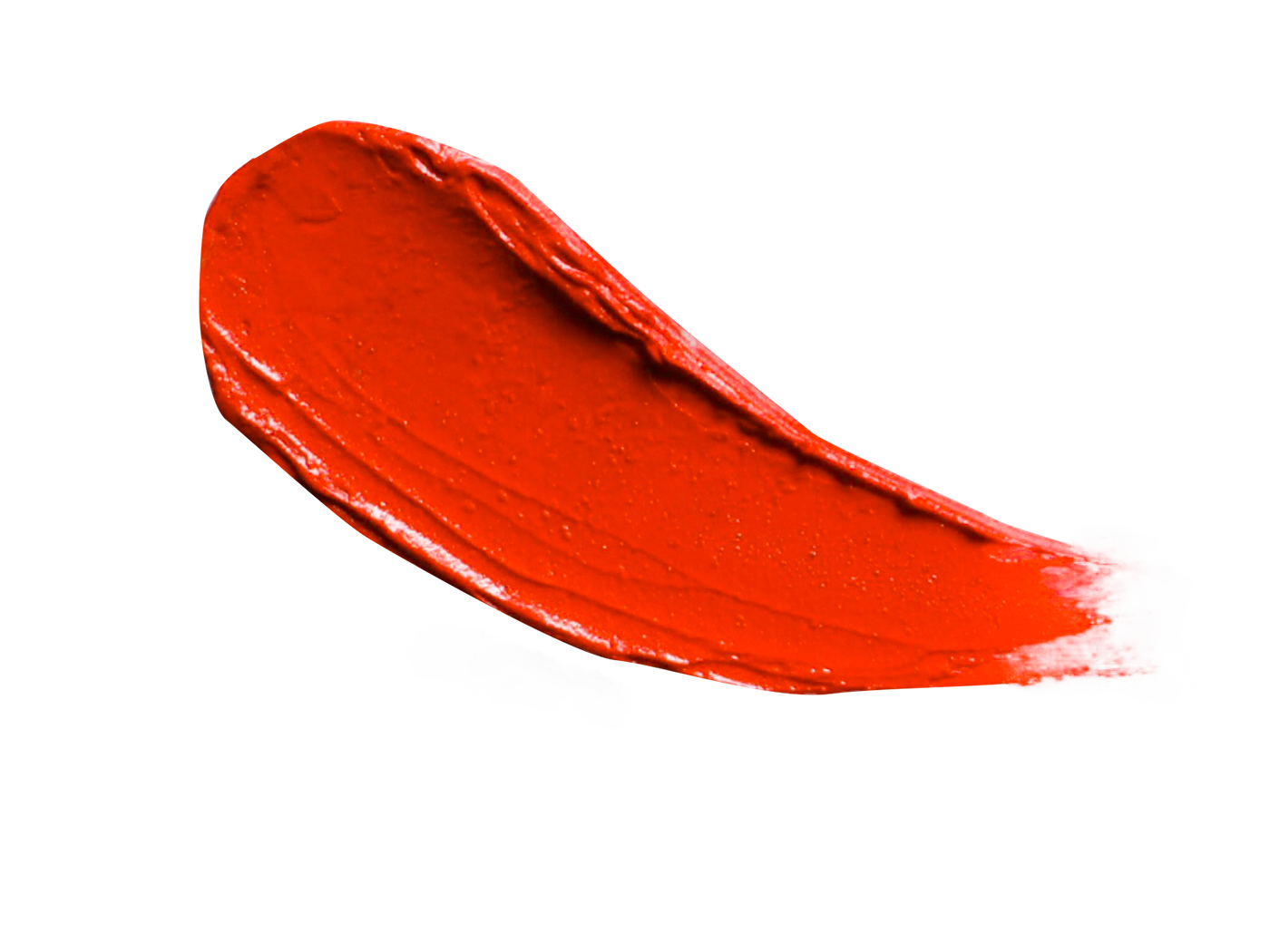
Red:
hot, passionate, angry, driven, powerful, war, determination, love, strength, pride, ambition, fire, blood, energy, danger, strength, love, raises blood pressure, raises metabolism.

Hi I’m Catherine,
“I balance authentic interior design with intuitive insight to help my clients connect to their deeper selves by empowering their own creative self expression.
I create space for them to follow their desires and depth of feeling, into a new environment that supports them, mind, body, & soul”
Love,
Catherine Rose

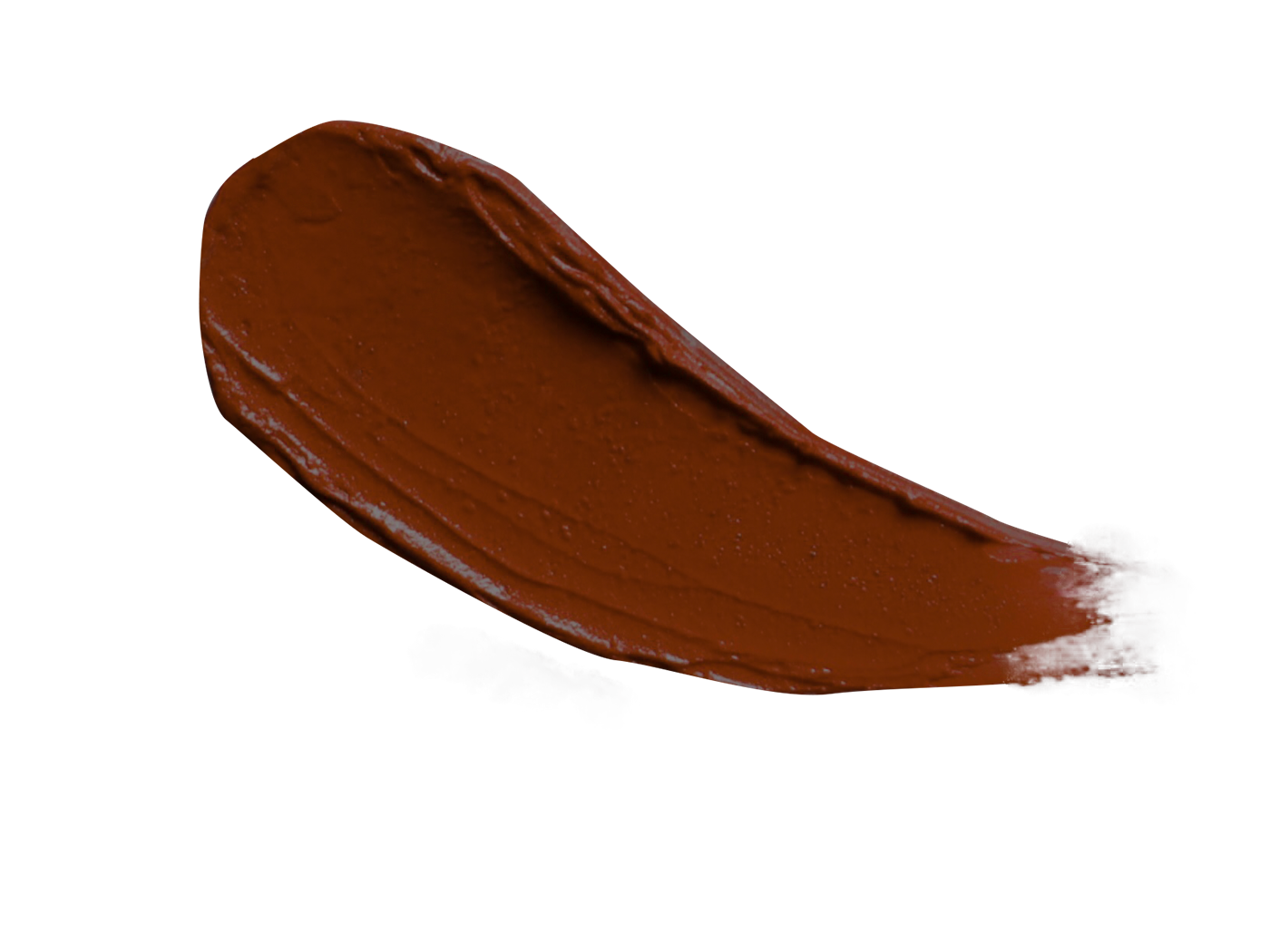
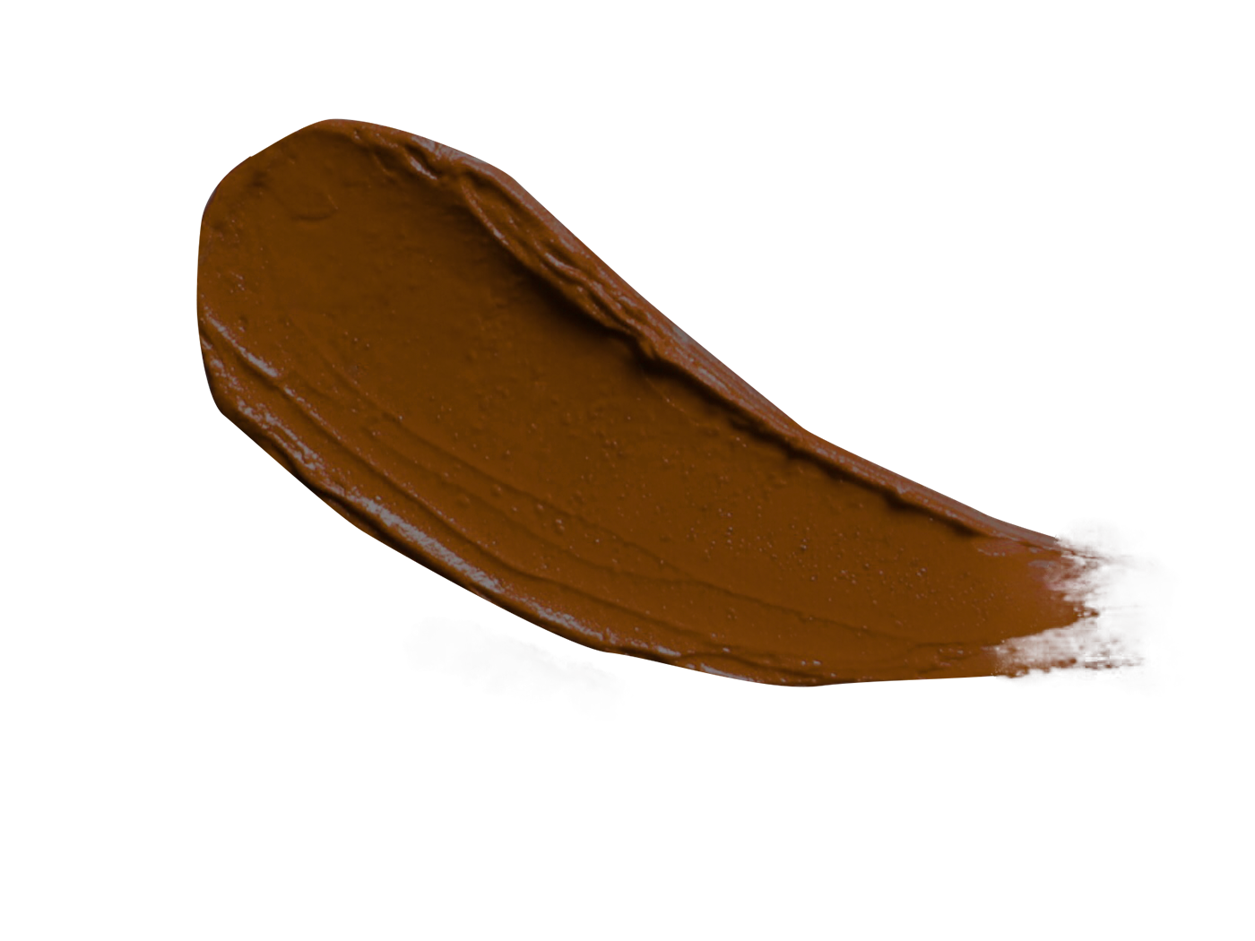
Reddish Brown:
Harvest, warmth, coziness, isolation
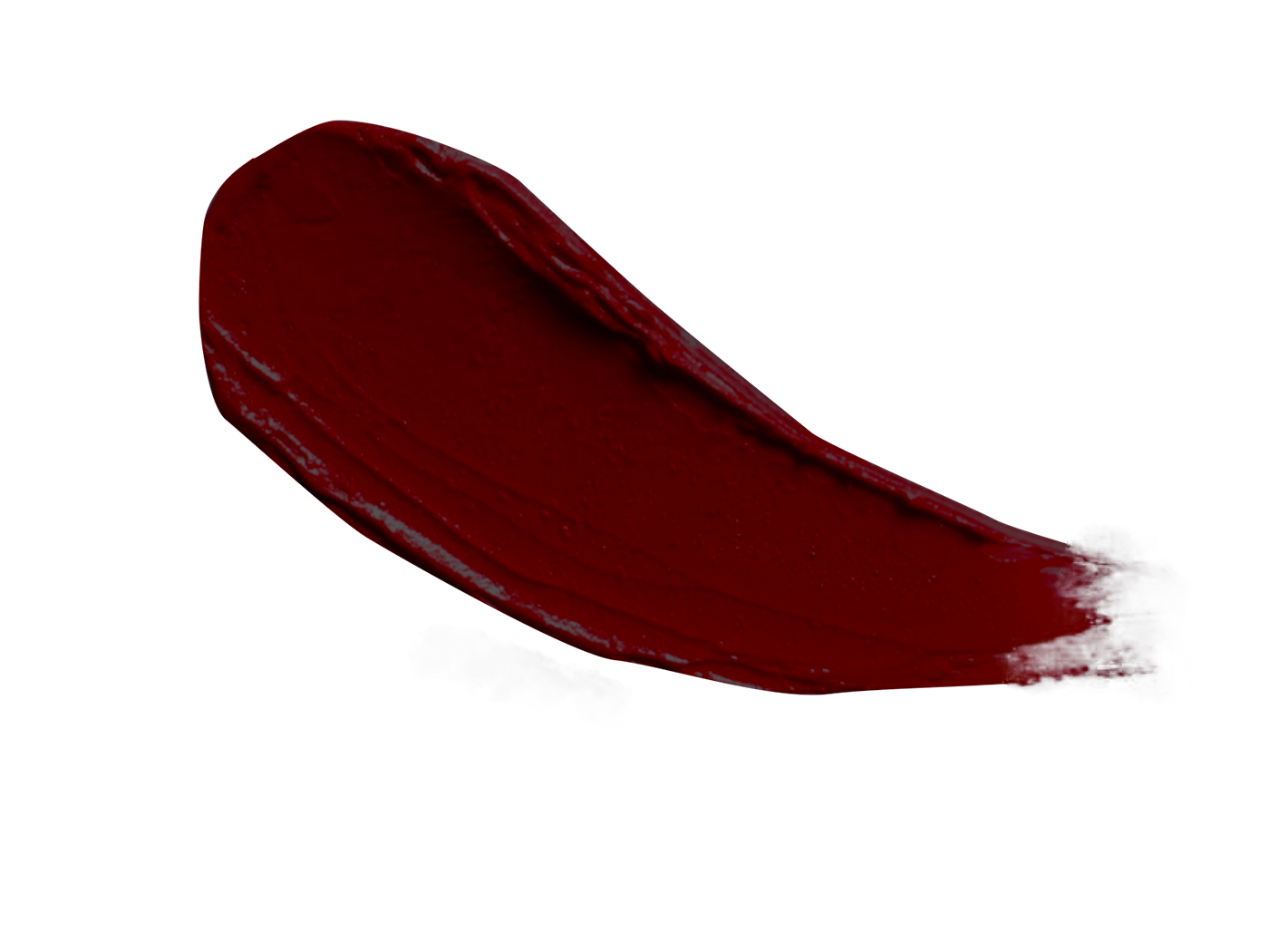
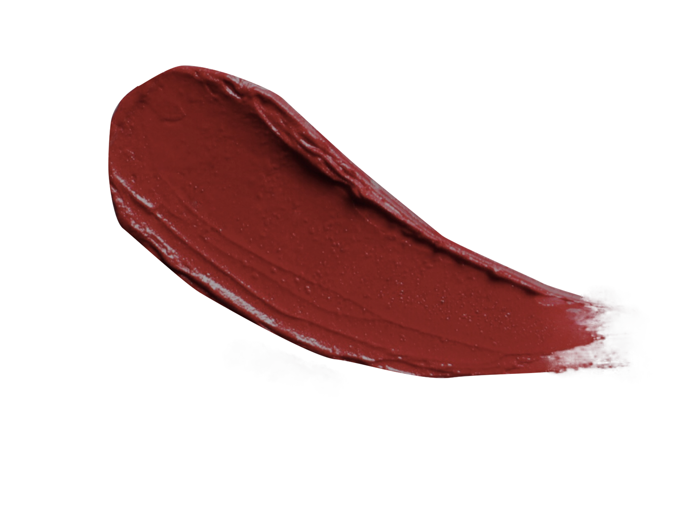
Dark Red:
Wrath, rage, anger, courage, vigor, willpower, longing.
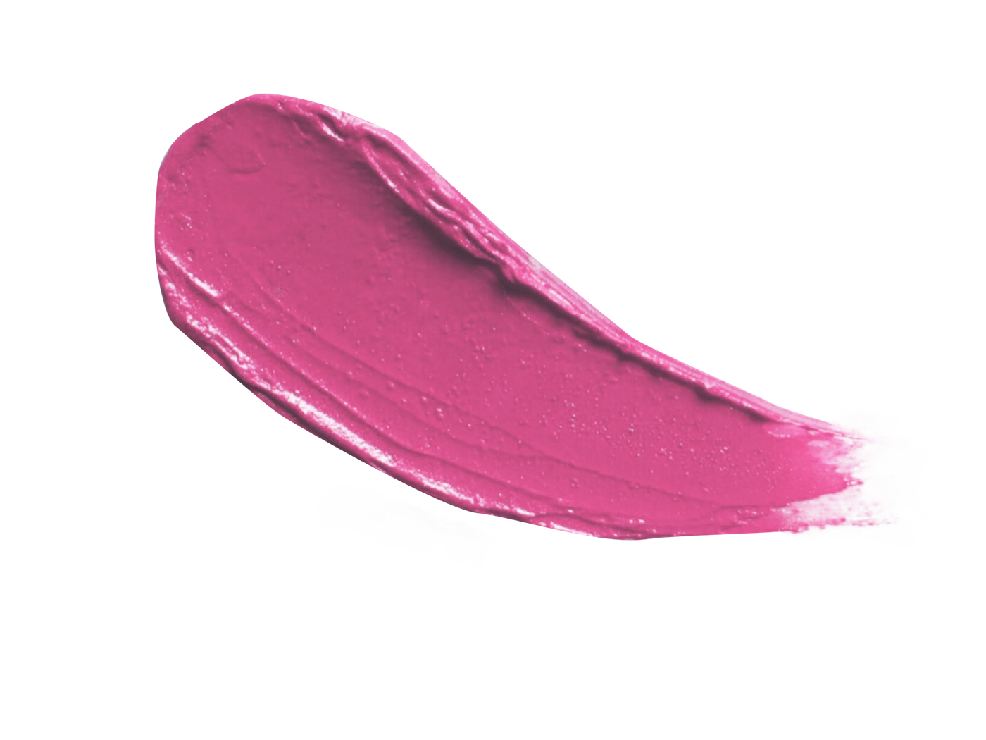
Pink:
softness, love, innocence, compassion, naïveté, sweetness,
calm, politeness, sensitivity, childishness, feminine, romantic.
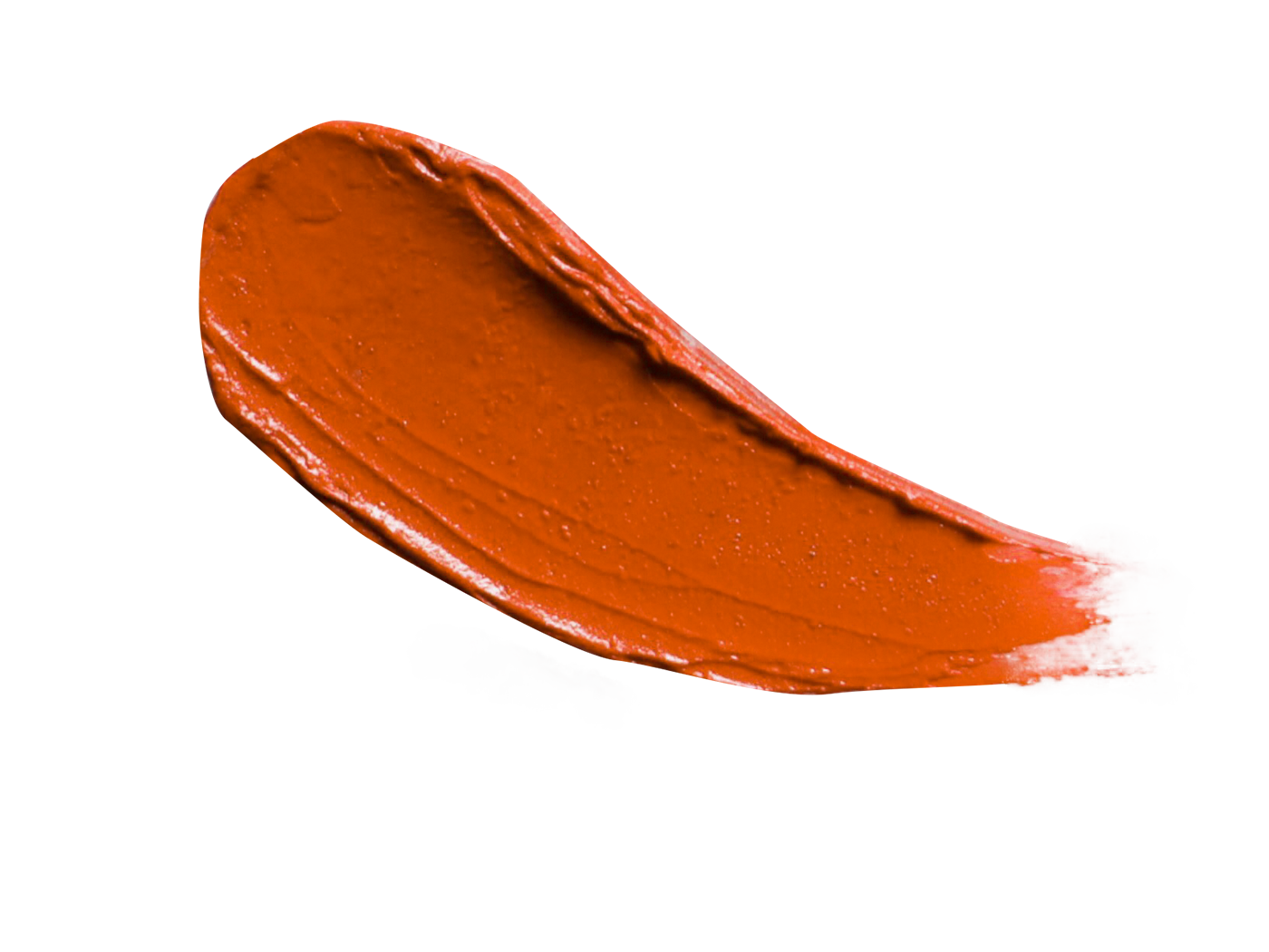
Orange:
Joy, sunshine, energy, warmth, activity, creativity, enthusiasm,
fascination, happiness, creativity, determination, attraction,
success, encouragement and stimulation.
Dark Orange:
distrust, deceit
Red-Orange:
Desire, sexual passion, domination, aggression, action
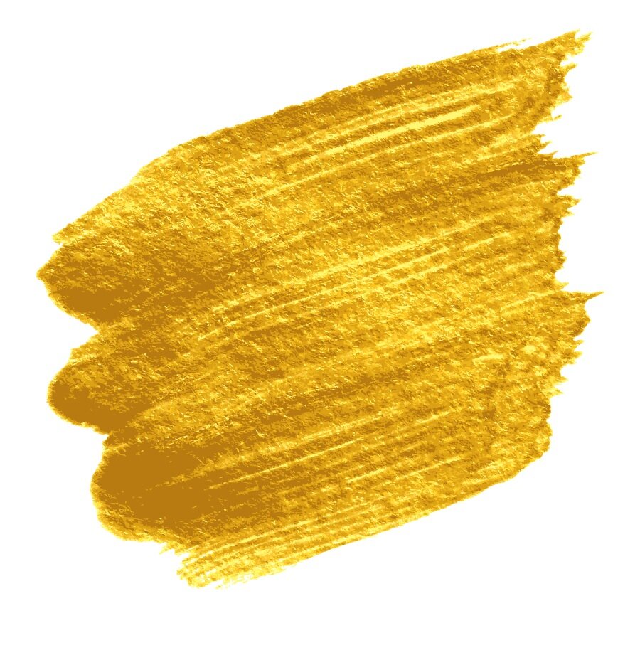
Gold:
prestige, wealth, extravagance, riches, pride
Light Orange:
warmth, softness, friendly, soothing
Brown Orange:
earthen, grounded, harvest, fall time, practical
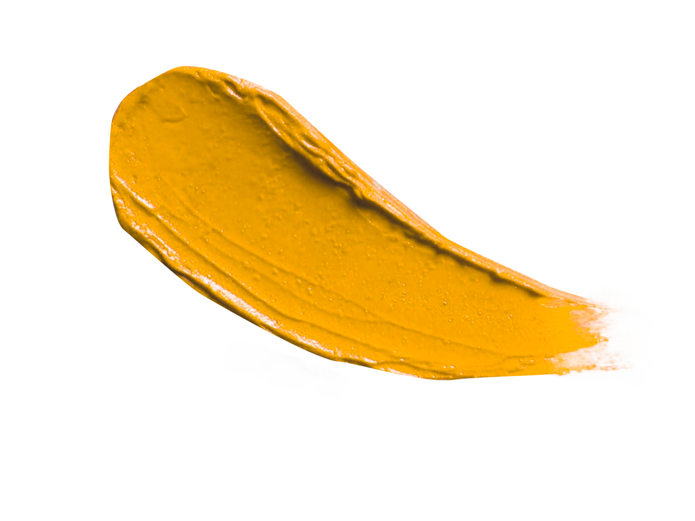
Yellow:
sunshine, energy, uplifting, joy, happiness, optimism,
can be too energizing for people, also cowardice
Light Yellow:
fresh, spring time, joy, calmer than bright yellow
Dull Yellow:
illness, decay, caution, sickness
Green:
nature, growth, grounding, rest, harmony, life, fertility
Dark Green:
jealousy, greed, money, ambition, forest
Yellow Green:
sickness, discord, jealousy
Olive Green:
grounded, steady, peace
Turquoise:
happy, summer, tropical, emotional healing, freshness
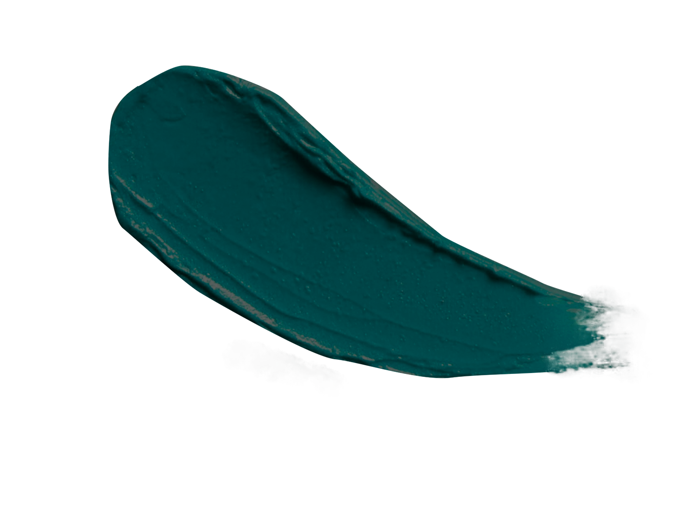
Teal:
masculine, cool, calm, revitalizing, combines qualities of blue and green
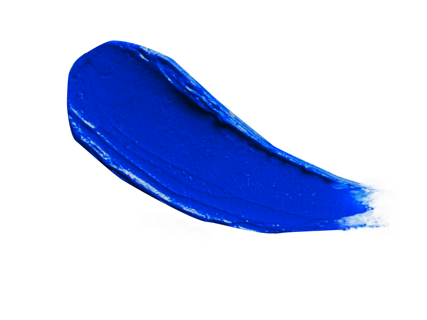
Blue:
Trust, loyalty, wisdom, confidence, intelligence, faith and trust, calming
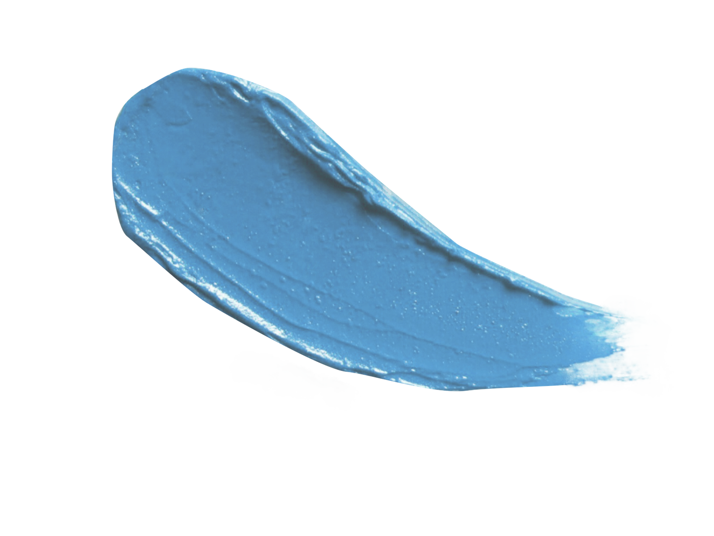
Light Blue:
healing, tranquility, understanding, softness, cold
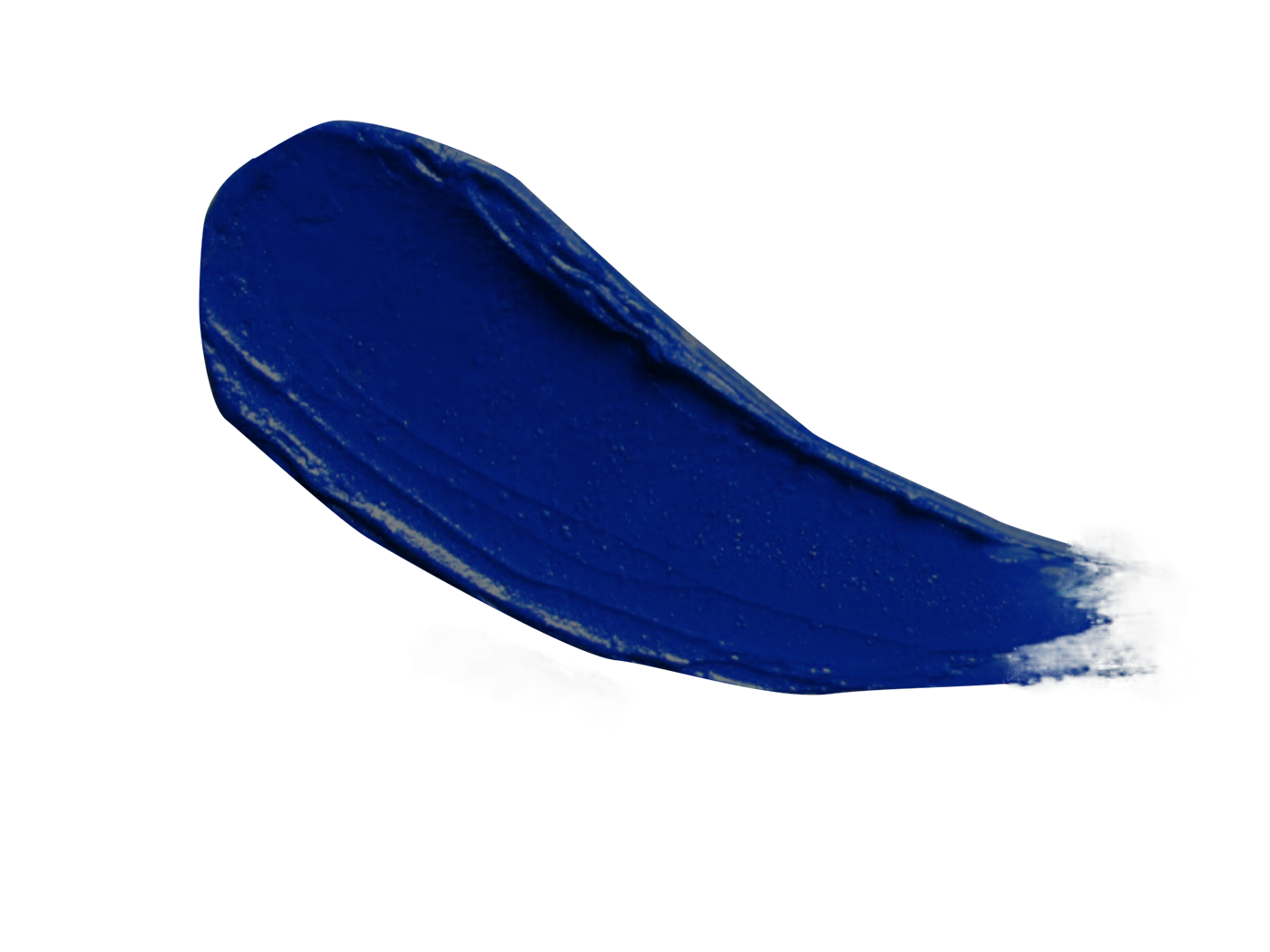
Midnight Blue:
mystery, depth, darkness, night, obscurity

Dark Blue:
knowledge, power, integrity, seriousness
Purple:
dramatic, royal, sophisticated, luxury, drama, mysterious
Light Purple:
restful, peaceful, happy, calm
Now we need to understand what colors you are drawn to so you can look deeper into these, compare them to your own and common associations, and find out the best way to incorporate them into your space.
Here are some simple exercises I may have my clients engage with if they don’t know what their color palette is!
Art:
What pieces of art are you attracted to? It is important when you think of this that you do not put the boundaries of thinking that this is going to be the color palette for your space! Gather images of your favorite art and lay it all out in front of you. What patterns do you see? What colors keeps showing up again and again? These colors are where you start.
Pinterest:
Probably without realizing it you have gathered a color palate that speaks to you! Look at what images you have saved, go through everything. Again what colors keep showing up again and again, what feelings do these bring up for you. Another great place to start!
Rug:
This one is easy! Just like the art, don’t limit yourself to thinking that the rug you choose is the one you will actually use in the space (although this is a very practical way to get a color palette for your room)! Find a rug either online or in real life that really lights you up. Use this as the jumping off point for your new environment!
Places:
Think of the spaces that make you feel the best too, even if they are outdoor environments. What about these places do you love, what colors do you think are eliciting these feelings within you, think about how you can start with these colors.
When you collect images, photos, pinterest pictures, and the artwork that you love think about why you may be drawn to these colors that show up. Think about who you are on a deeper level and why that person loves what they love. From this place you can get clues to why and how color should be used in your environment!
Now, lets say you read these associations and are sad because you realize that you love dull yellow! You still should incorporate this into your space! However since you know how this may make other people feel you should consider to what degree you use it. Below are some other color factors that can help in your creative process and use your colors intentionally.
Hue:
Is basically the color itself as described by the color names above like purple.
Value:
Is basically the amount of black or white has been added to a color. This can drastically change the way the color makes you feel. For example Pink is actually red that lots of white has been added to and both of these colors create very different feelings. A tint of purple is lavender.
Chroma:
Is the amount of saturation of the color. Basically if you would like to amplify the feelings of the color you should use a saturated version of it, lets say you personally love the color but you would like to minimize the emotional effects, you should think about using a shade that is less saturated! Royal purple is a more saturated version of lavender.
These properties above can help you choose exact shades of a color that serve you, not compromising your favorite colors but using them well!
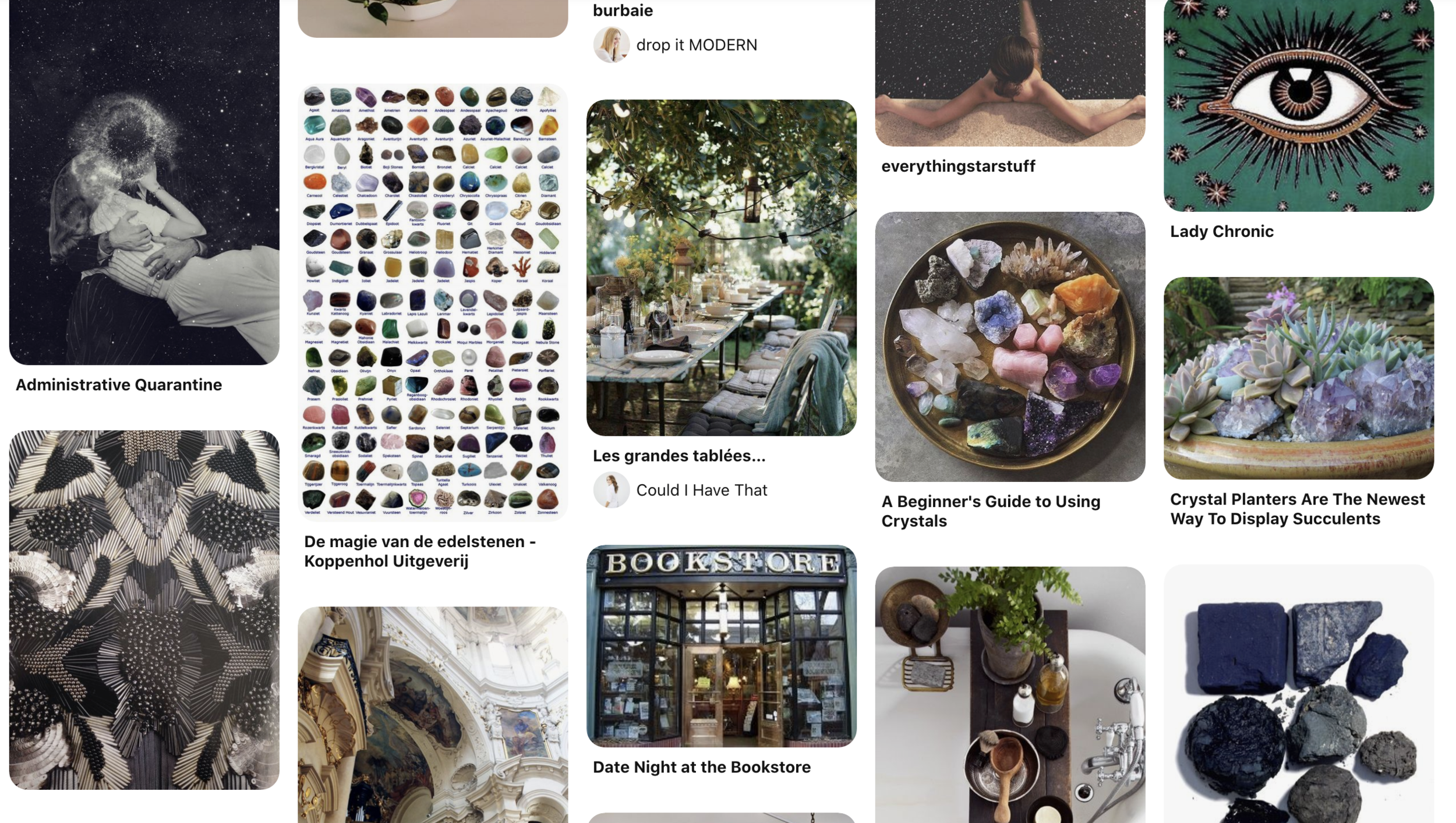
Pinterest Feed
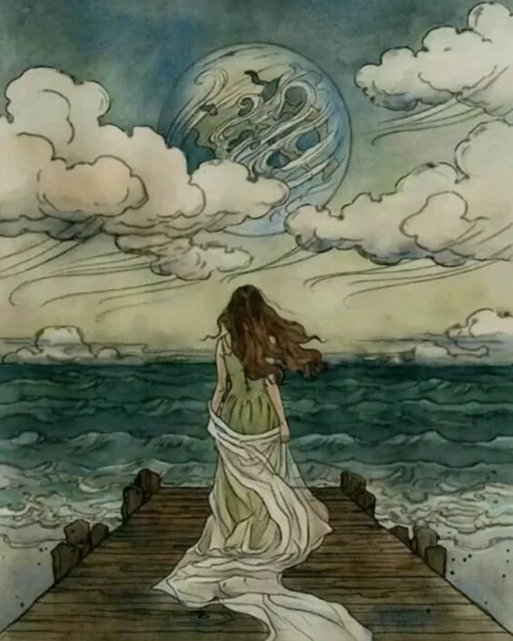
Art I Love
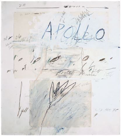
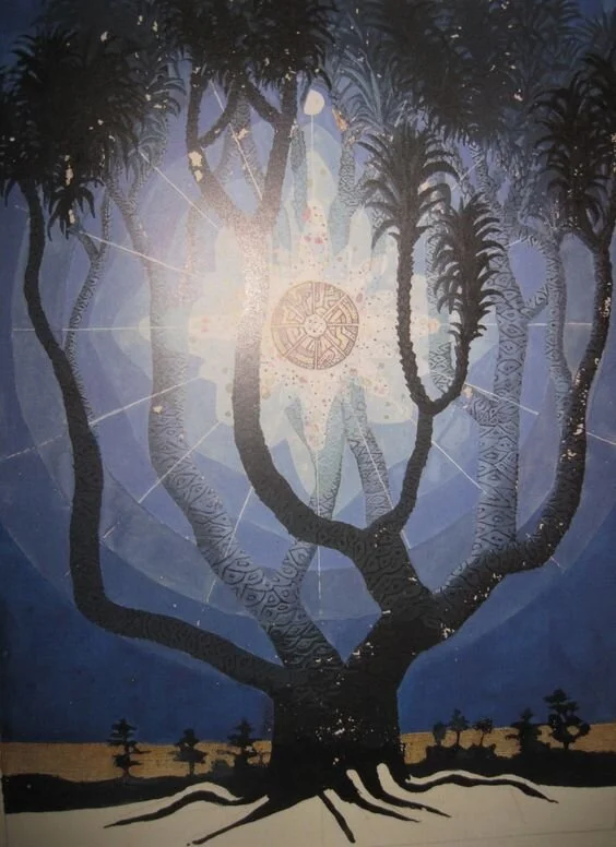
- Cy Twombly
- Carl Jung
I want to explain how you can use this information to use your colors intelligently in your environment, using my palette as an example for you.
In my own life I am a sensitive and pretty introverted person. My favorite place is the ocean and I love the night sky and the moon. I’ve included some images from my own pinterest feed above as well as some art that I deeply love.
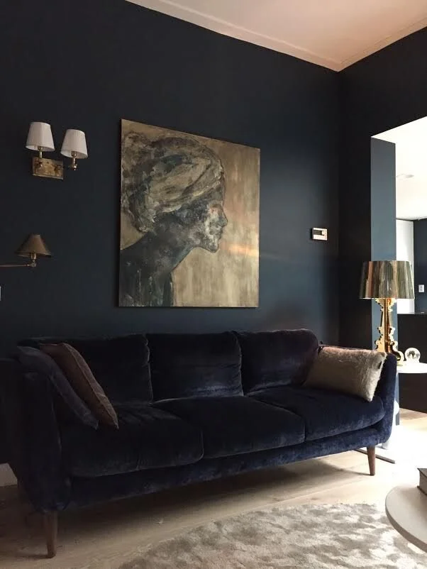
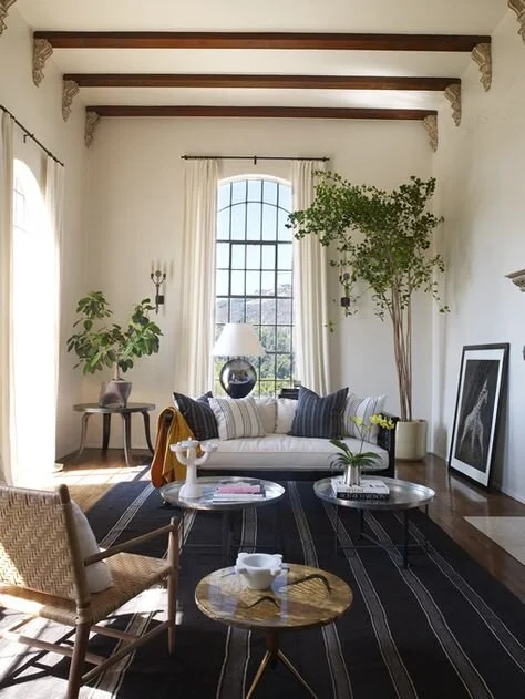
My color palette tends to gravitate to black, white, and neutrals and mostly cool colors as you can see from the images above. Even though turquoise is one of my favorite colors, because it’s a very energetic color I use it sparingly in my environment, as more of an accent, not a wall color. My favorite color is an almost black midnight blue, but because I love natural light in my living space I may only use this color in my bedroom in large amounts!
Let’s take the two rooms below as an example of color usage and see if this seems right for you.
As shown below that beautiful midnight blue/black I love may be too intense for my entire living space (image at left), but when used intentionally as the contrast against white walls and wood accents it can be just right (image at right).
I would love to hear if you guys engaged with any of these color activities and if you perhaps discovered your own personal color palette through this?!
More than that I would love to see the images and collections that got you there! Please reach out!
I hope these exercises help you creatively design your own environment.
When working with color remember these important words from the ephemeral Jane Austen…
“We all have a better guide in ourselves, If we would
attend to it, than any other person can be.”
If you would like to read some of my own random journal entries go to •musings•
If you are interested in more Interior design, deeper self, wellness, or psychology posts…
Interior Design & Deeper Self
If you are looking to see more post like these in general you should join the community by signing up below!
I would love to connect with you deeper!
Love,

Are you new here?
Welcome to Catherine Rose Design!
I also have the following blogs and resources to help you with your holistic interior design goals if you are looking for more!:

Did you enjoy this advice?
Consider exchaging some energy with me to support future offerings!